COVID-19 data analysis
Let us revisit the CDC Covid-19 Case Surveillance Data. There are well over 3 million entries of individual, de-identified patient data. Since this is a large file, I suggest you use vroom to load it and you keep cache=TRUE in the chunk options.
# URL link to CDC to download data
url <- "https://data.cdc.gov/api/views/vbim-akqf/rows.csv?accessType=DOWNLOAD"

covid_data <- vroom(url)%>%
  clean_names()
Given the data we have, I would like you to produce two graphs that show death % rate: (Do we need to perform data cleansing on missing values? to be discussed) (Double faceting for both, use facet_grid, check R docu) 1. by age group, sex, and whether the patient had co-morbidities or not sex, age_group, medcond_yn, death_yn!
covid_data_deathrate1 <- covid_data %>%
filter(!(death_yn %in%c("Missing","Unknown")),
!(medcond_yn %in%c("Missing","Unknown")),
!(is.na(age_group)),
!(age_group %in%c("Missing","Unknown")),
!(is.na(sex)),
!(sex %in%c("Missing","Unknown"))) %>%
group_by (age_group, sex, medcond_yn, death_yn) %>%
count(death_yn) %>%
group_by (age_group, sex, medcond_yn) %>%
mutate(death_rate = n*100/sum(n)) %>%
filter(death_yn=="Yes") %>% mutate(comorb = ifelse(medcond_yn=="No","Without Comorbidities","With Comorbidities"), death_rate = round(death_rate,1))
covid_data_deathrate1 %>%
ggplot(aes(x= age_group, y = death_rate, fill=sex))+
geom_col()+
coord_flip()+
facet_grid(col=vars(sex),row=vars(comorb))+
theme(axis.text.x = element_text(angle = 30)) +
geom_text(aes(label=death_rate), position=position_dodge(width=0),hjust = -0.25)+ theme_bw()+
labs(title="Covid death % by age group, sex and presence of co-morbidities",
x="",y="", caption="Source:CDC")+
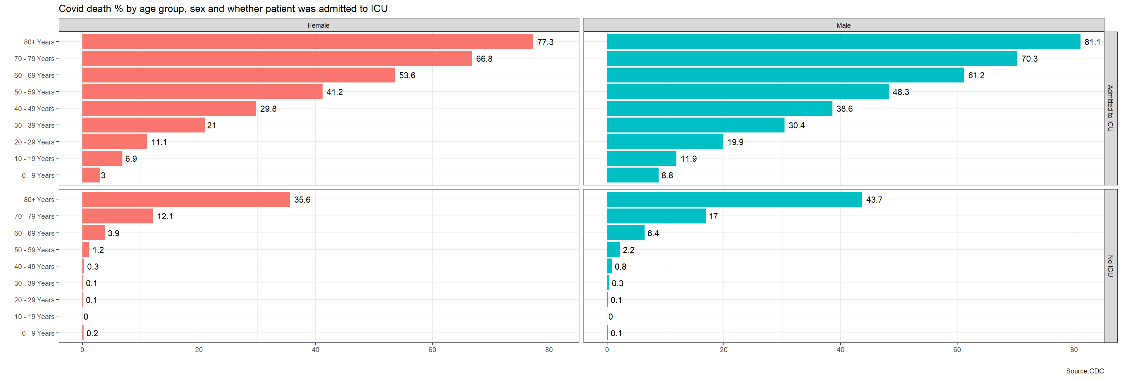
theme(legend.position = "none")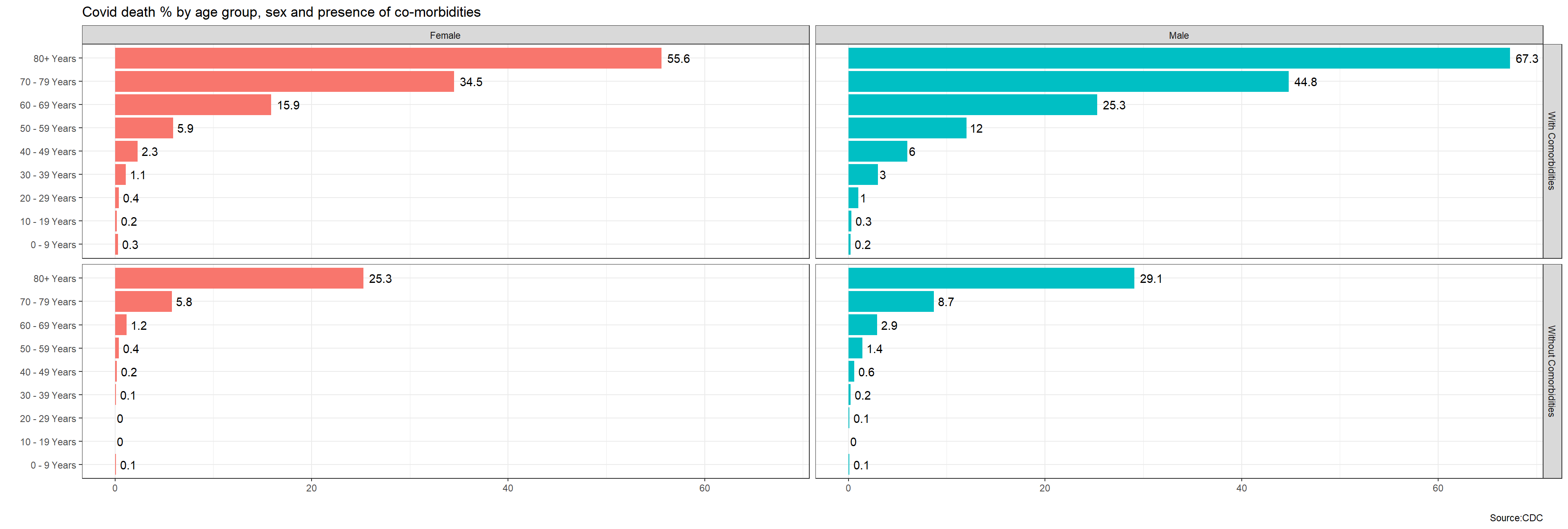 1. by age group, sex, and whether the patient was admitted to Intensive Care Unit (ICU) or not.
sex, age_group, icu_yn, death_yn!
1. by age group, sex, and whether the patient was admitted to Intensive Care Unit (ICU) or not.
sex, age_group, icu_yn, death_yn!